Your website is often the first interaction potential clients have with your business. A well-designed website can build trust, communicate value, and convert visitors into paying customers. But if your website is poorly designed, it can do the exact opposite—drive people away.
Many businesses struggle with low conversions not because of lack of traffic, but because of avoidable website design mistakes. In this article, we’ll break down five common website design mistakes that may be costing you clients—and how to fix them.
1. Poor First Impression
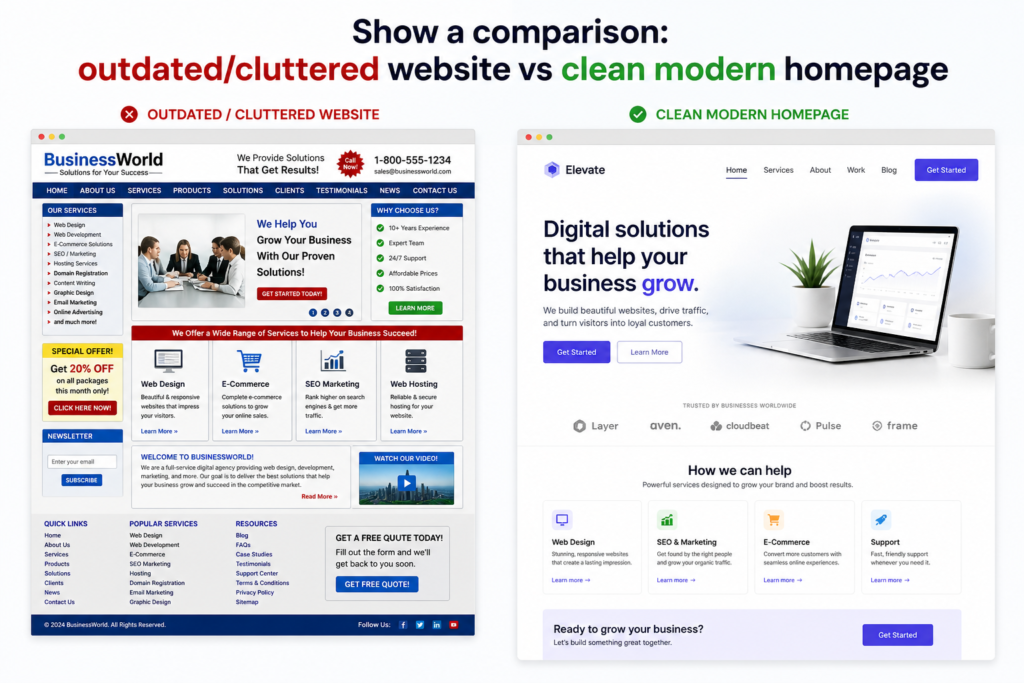
Users form an opinion about your website within seconds. If your design looks outdated, cluttered, or unprofessional, visitors are likely to leave immediately.
Common issues include:
- Outdated layouts
- Inconsistent colors and fonts
- Low-quality images
- Lack of visual structure
Why it matters:
A poor first impression reduces trust. If your website doesn’t look credible, users won’t feel confident doing business with you.
How to fix it:
- Use a clean, modern layout
- Maintain consistent branding
- Invest in high-quality visuals
- Keep your homepage simple and focused
2. Confusing Navigation
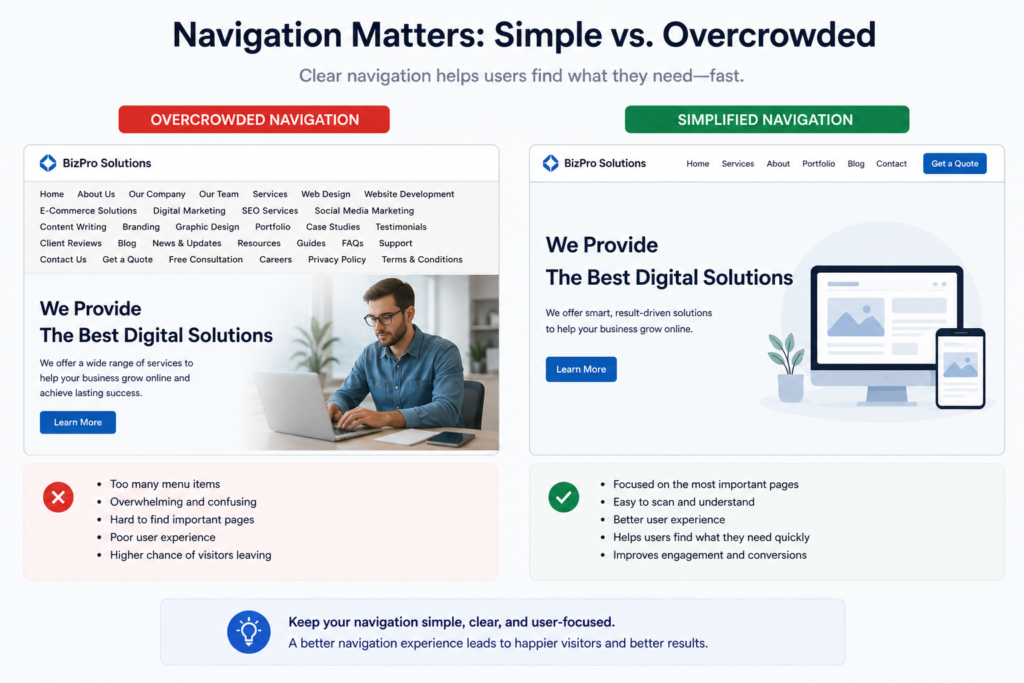
If visitors can’t find what they’re looking for quickly, they will leave. Complicated navigation creates frustration and increases bounce rates.
Signs of poor navigation:
- Too many menu items
- Unclear page labels
- Hidden important information
- No clear user flow
Why it matters:
Users should be able to understand your website within seconds. Confusion leads to lost opportunities.
How to fix it:
- Limit your main menu to essential pages
- Use clear and simple labels (e.g., “Services,” “About,” “Contact”)
- Make navigation visible and easy to use
- Guide users with a logical page structure
3. Weak or Unclear Messaging
Even with great design, poor messaging can kill conversions. If visitors don’t understand what you offer or how it helps them, they won’t take action.
Common messaging problems:
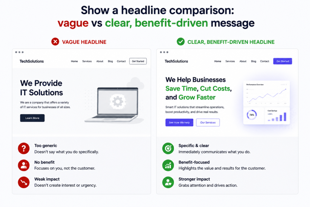
- Vague headlines
- Too much text without clarity
- Focus on the business instead of the customer
- Lack of clear value proposition
Why it matters:
Your website should quickly answer:
- What do you offer?
- Who is it for?
- Why should they choose you?
How to fix it:
- Write clear, benefit-driven headlines
- Keep content simple and direct
- Focus on solving the customer’s problem
- Highlight your unique value
4. No Clear Call-to-Action (CTA)
A website without a clear call-to-action leaves users unsure of what to do next. This leads to missed opportunities and lost clients.
Common CTA mistakes:
- No visible CTA buttons
- Weak or generic text (e.g., “Submit”)
- Too many competing actions
- CTAs placed inconsistently
Why it matters:
Visitors need direction. Without it, they won’t take the next step.
How to fix it:
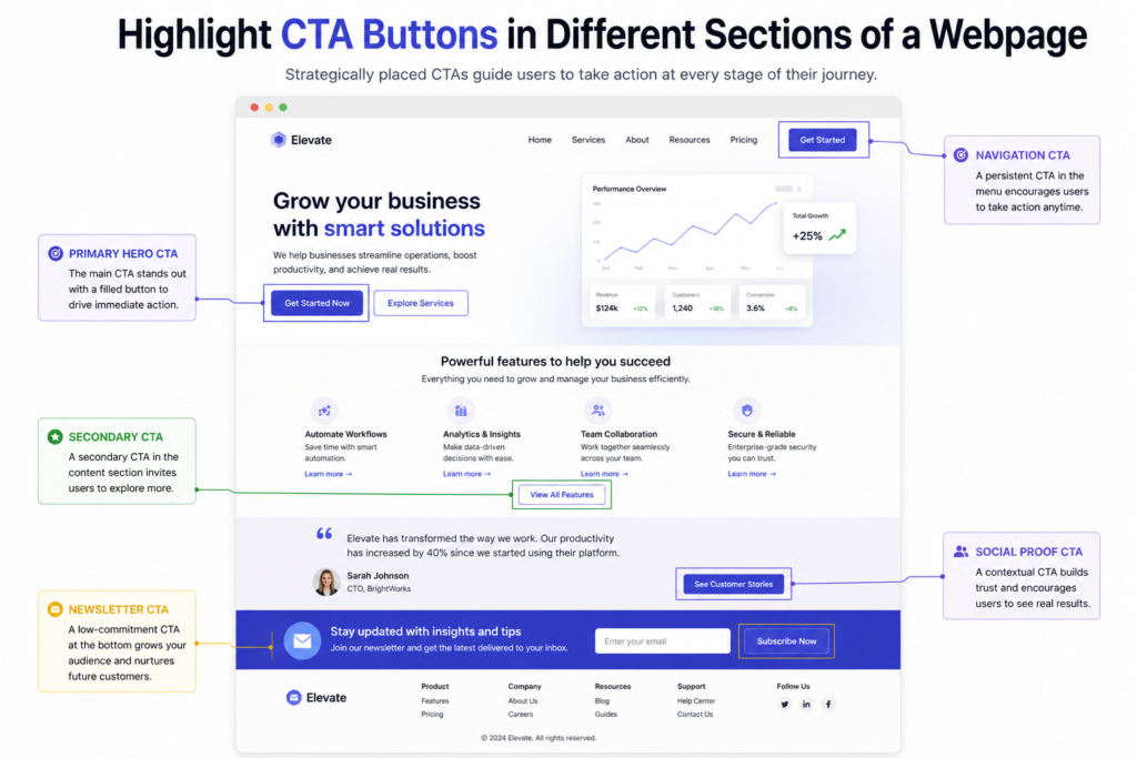
- Use clear, action-oriented CTAs (e.g., “Book a Call,” “Get Started”)
- Make buttons stand out visually
- Place CTAs strategically across your pages
- Keep your primary goal clear
5. Not Optimized for Mobile
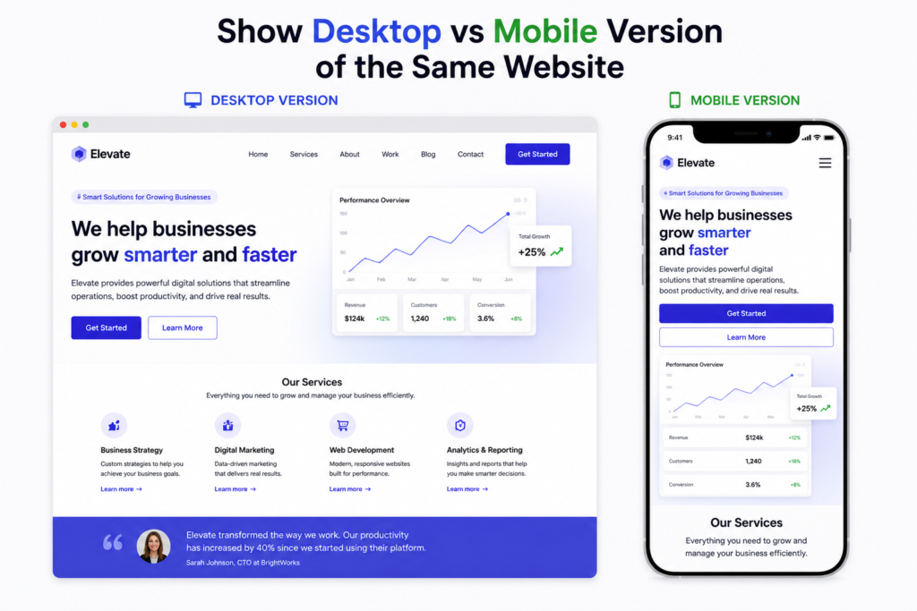
A large percentage of users browse websites on their phones. If your website isn’t mobile-friendly, you’re losing potential clients.
Common mobile issues:
- Text too small to read
- Buttons hard to click
- Layout not responsive
- Slow loading speed
Why it matters:
A poor mobile experience frustrates users and reduces conversions.
How to fix it:
- Use responsive website design
- Ensure text is readable on all devices
- Optimize images for faster loading
- Test your website on multiple screen sizes