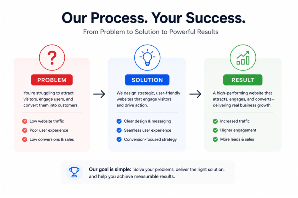
A visually appealing website is no longer enough. In today’s digital landscape, a high-performing website must do more than look good—it must guide, persuade, and convert visitors into customers. This is where psychology-driven website design comes in.
Understanding how users think, behave, and make decisions online allows you to design a website that not only attracts attention but also drives action. In this article, we’ll break down the key psychological principles behind high-converting websites and how you can apply them effectively.
1. First Impressions Matter (And They Happen Fast)
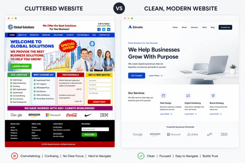
Users form an opinion about your website within seconds. This initial impression determines whether they stay or leave.
To create a strong first impression:
- Use a clean, professional layout
- Choose a consistent color palette that reflects your brand
- Ensure fast loading speed
- Make your headline clear and benefit-driven
Key Insight: People associate visual quality with credibility. A polished design builds trust instantly.
2. The Power of Visual Hierarchy
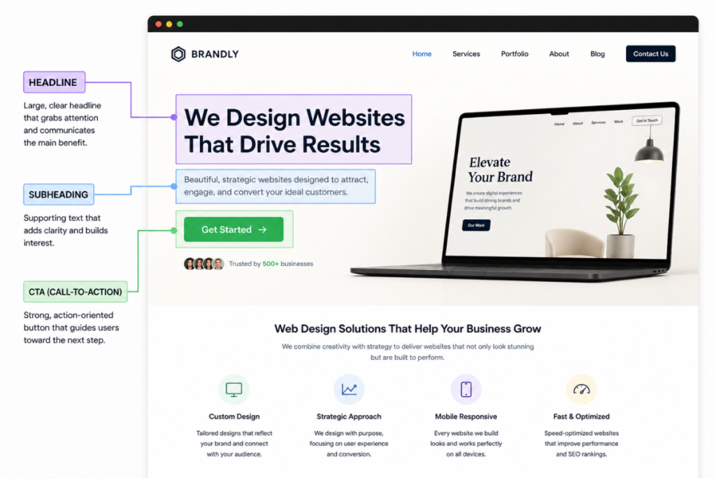
Visual hierarchy guides users’ attention across your website. It helps visitors quickly understand what matters most.
Effective hierarchy includes:
- Large, bold headlines
- Clear subheadings
- Contrasting CTA buttons
- Proper spacing between sections
Why it works:
Users scan content instead of reading every word. A structured layout improves readability and engagement.
3. Simplicity Reduces Friction
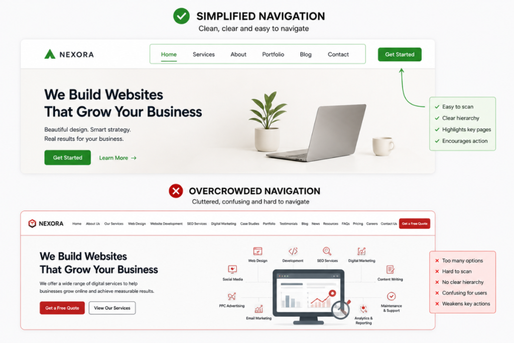
A complicated website creates confusion, and confusion leads to drop-offs. High-performing websites are simple and easy to navigate.
Focus on:
- Minimal menu options
- Clear messaging
- Straightforward user journeys
- Eliminating unnecessary elements
Key Insight: The easier it is for users to take action, the more likely they will.
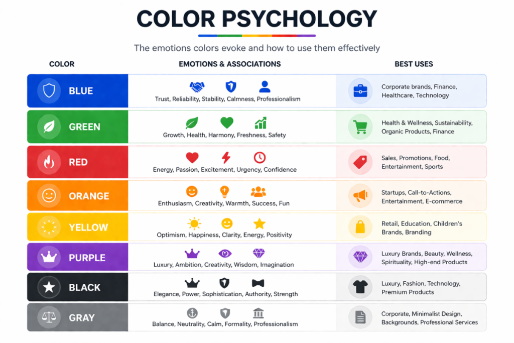
4. Color Psychology Influences Decisions
Colors evoke emotions and influence how users perceive your brand.
Common associations:
- Blue: Trust and professionalism
- Black: Luxury and sophistication
- Green: Growth and calmness
- Red: Urgency and excitement
Use color strategically to:
- Highlight important elements (like CTA buttons)
- Reinforce brand identity
- Guide user attention
Important: Consistency is key. Too many colors can overwhelm users.
5. Social Proof Builds Trust
People trust what others trust. Social proof reassures visitors that your business is credible and reliable.
Examples of social proof:
- Testimonials
- Client logos
- Case studies
- Reviews and ratings
Why it works:
It reduces uncertainty and increases confidence in your services.

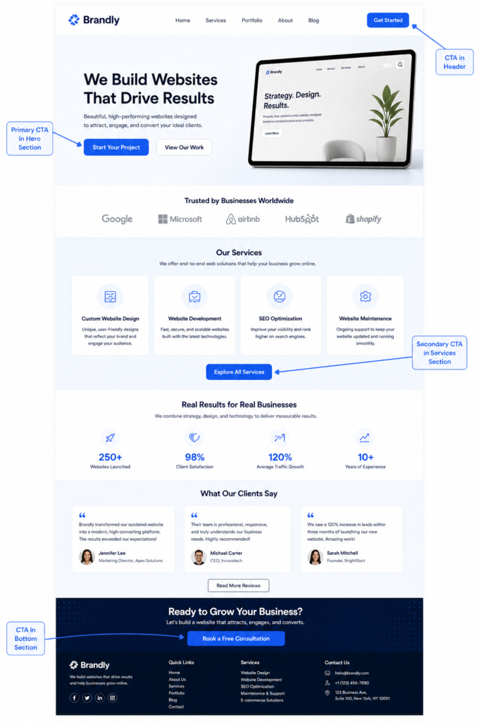
6. Clear Call-to-Actions Drive Conversions
Your website should always tell users what to do next.
Effective CTAs:
- Use action-driven text (e.g., “Get Started”, “Book a Call”)
- Stand out visually
- Appear throughout the page
- Create urgency where appropriate
Key Insight:
Never leave users guessing—guide them clearly.
7. The Role of Storytelling in Design
People connect with stories, not just information. A high-performing website uses storytelling to engage visitors and communicate value.
Your website should answer:
- Who you are
- What you offer
- Who it’s for
- Why it matters
Structure your content like a story:
- Identify the problem
- Present your solution
- Show the transformation
Why it works:
Storytelling creates emotional connection, making your message more memorable and persuasive.